Typography Poster Podcast
Updates
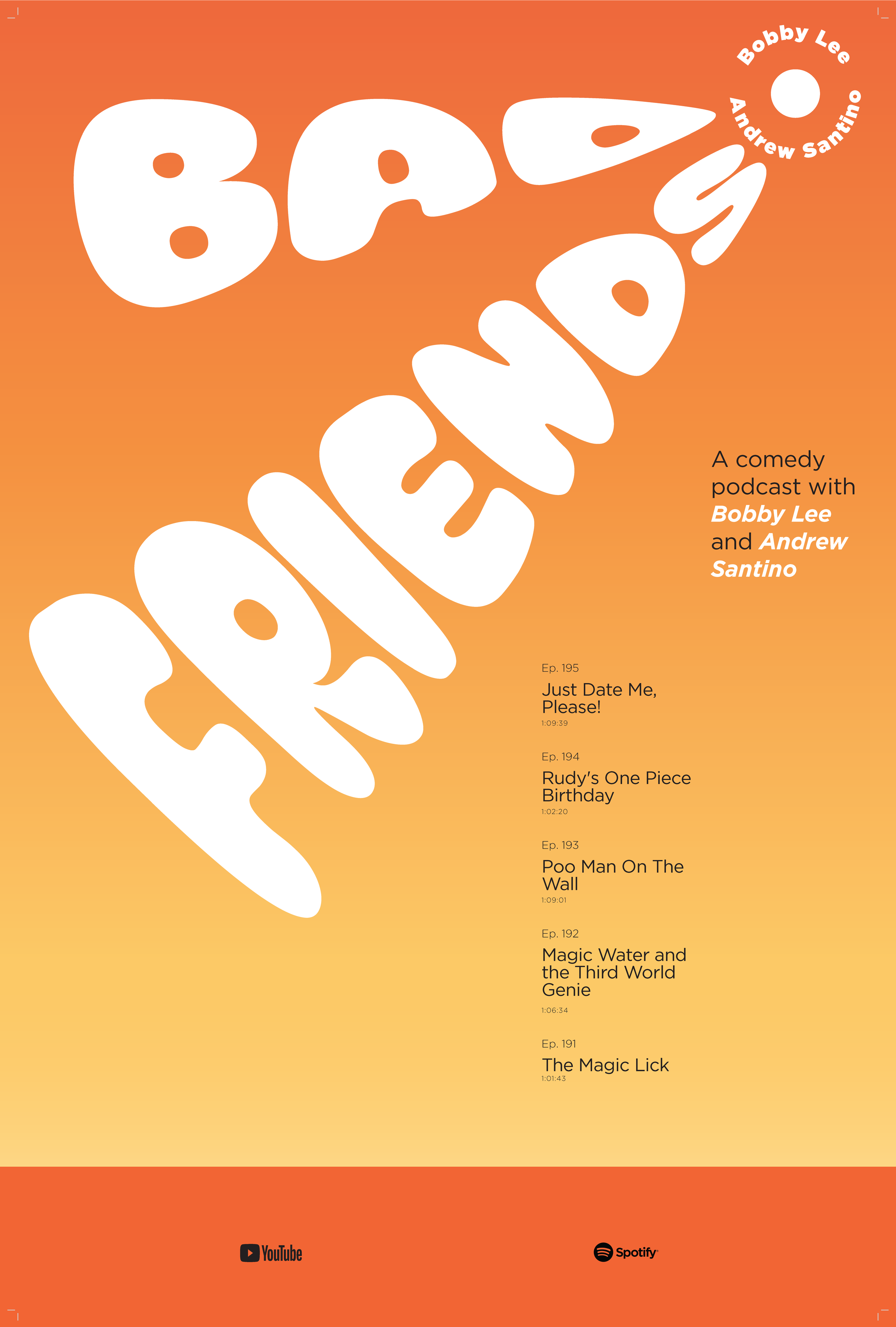
After returning to this project, I decided to completely revamp my initial design. Instead of a simplistic and disorganized poster that lacked a message, I decided to use a more energetic “comic book” appearance within my poster to align more with the concepts I chose for this project (energetic, fun, and chaotic). I used comic bubbles and a dot gradient within my design to achieve this and used the colors of these gradients to help with the hierarchy within my poster.
BeforeAfterProcess Work
I largely used a hierarchy of scale to relay which information about my podcast is the most important throughout the process of reaching my final design for this poster. The large size of the headline draws attention to the name of the podcast first, and the diagonal angle of the headline pulls the eyes to the introduction of the podcast. The body text is a smaller size than the header, but I use the large grouping to pull the viewer’s attention there next. I also used various fonts of the typefaces used in my informational text to create smaller hierarchal scales (Noteworthy Bold and Noteworthy Regular for body copy, and Kraash Black Regular to highlight important information, such as the names of the creators of the podcast and the dates of each episode.) I used the typeface SF Movie Poster in my headline to give it a much more dynamic and high-energy feeling.


