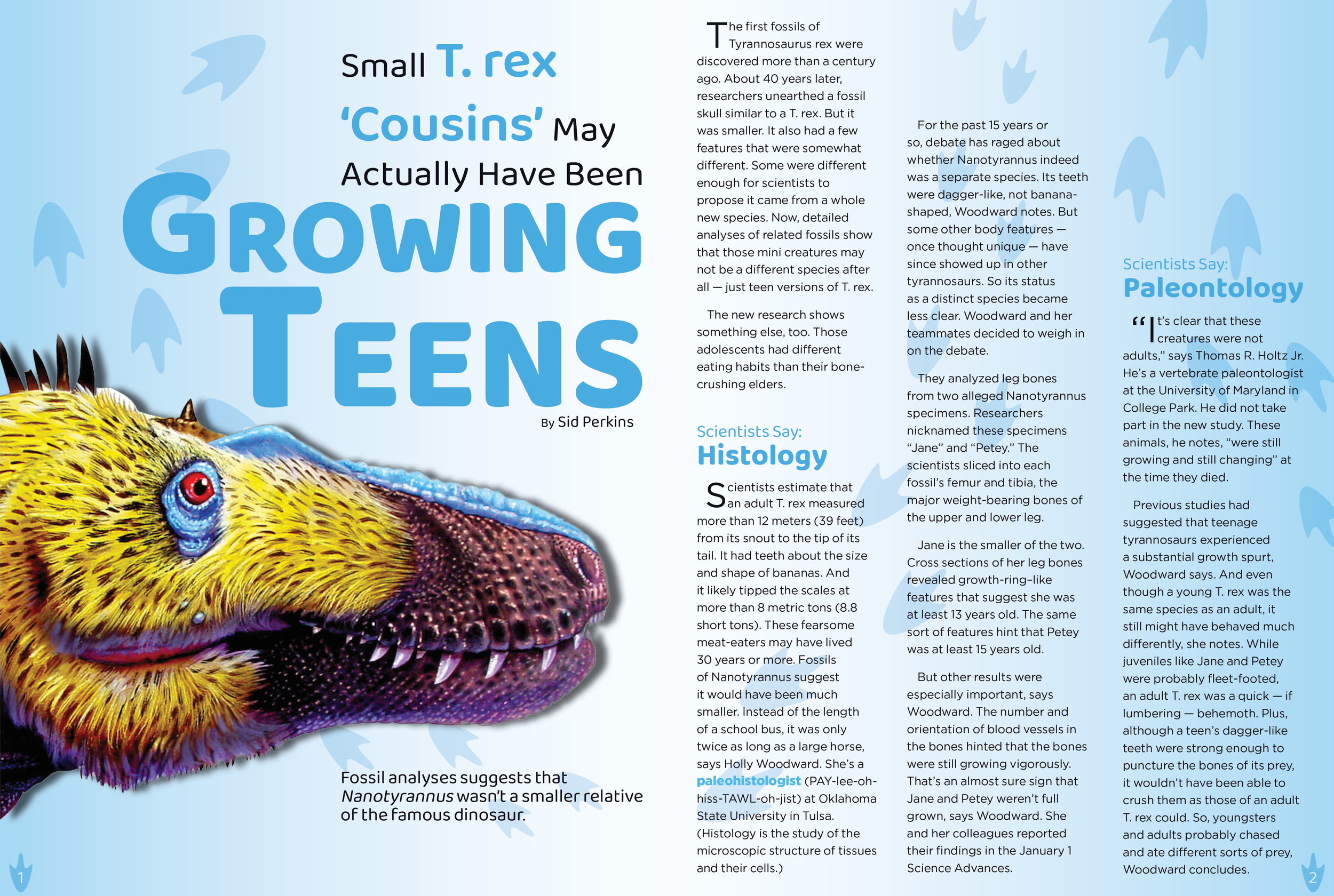
Magazine Spread Reboot
Final Design
I used a brightly colored graphic of a dinosaur to help draw the eye into the article and used imagery of dinosaur footprints to help guide the reading pattern of the article. I chose another sans serif typeface (Gotham Book) for my body text because it is easily legible and would not become hard to read when laid over the footprint visuals in the background. I also used the same bright blue color from the title to highlight the subheadings and important words in the article to help the reader easily recognize the significance of each part of the text.
Process Work
Initially, I began my magazine spread focused solely on a “scientific” and uncreative approach with minimal earthy tones I gathered from my research about both my own article and similar ones. After reevaluation of my key principles (hierarchy, reading pattern, and affordances), I decided that I would begin designing for something more creative, bright, and interesting for a younger audience. I took inspiration from children’s National Geographic magazines and articles while working with the hierarchy and typeface of my title (Baloo Bhai 2), using a sans serif typeface with rounded edges to appeal to a younger mindset, and using size and color to appeal to hierarchical cues.


