Bitmap Monogram
Updates
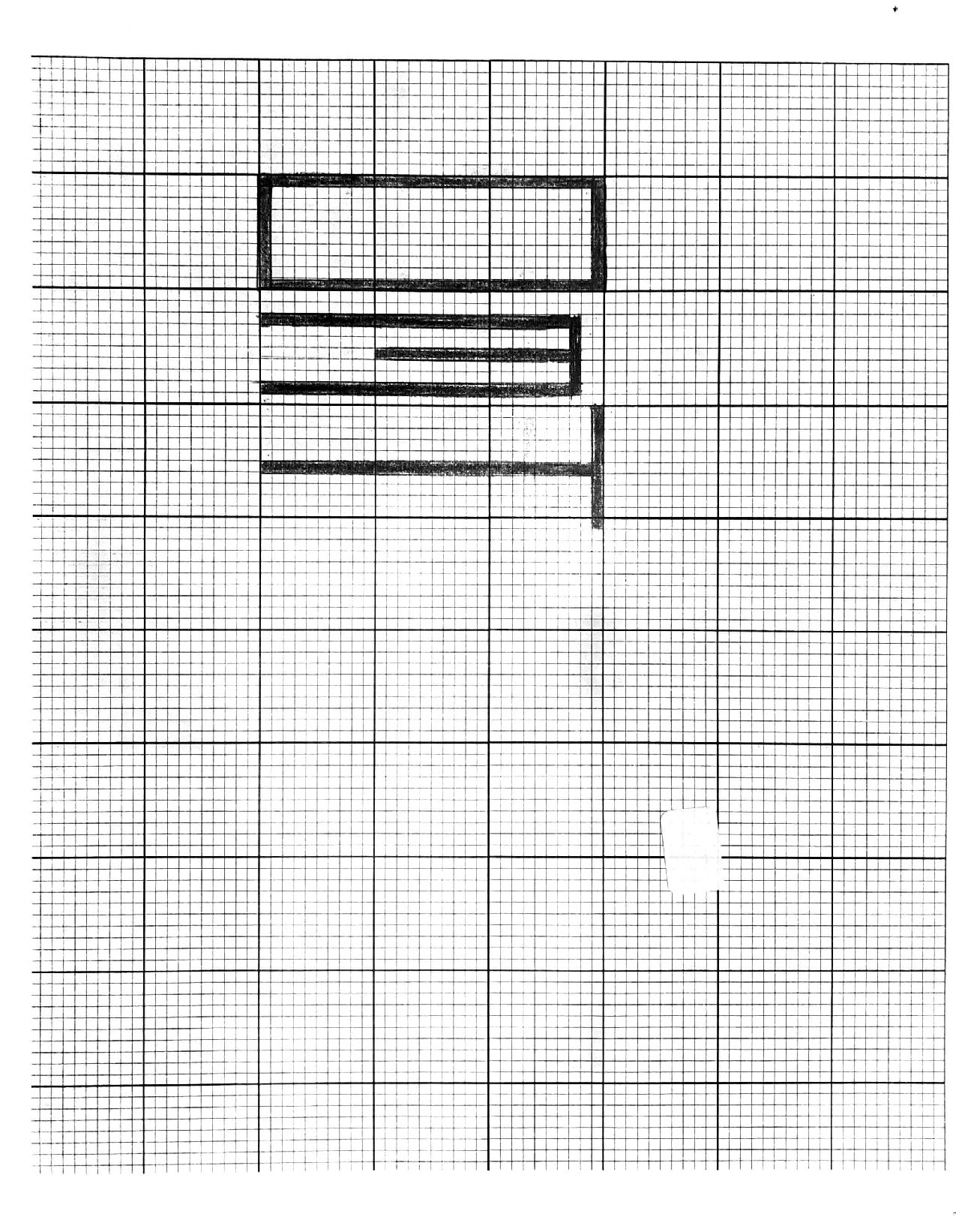
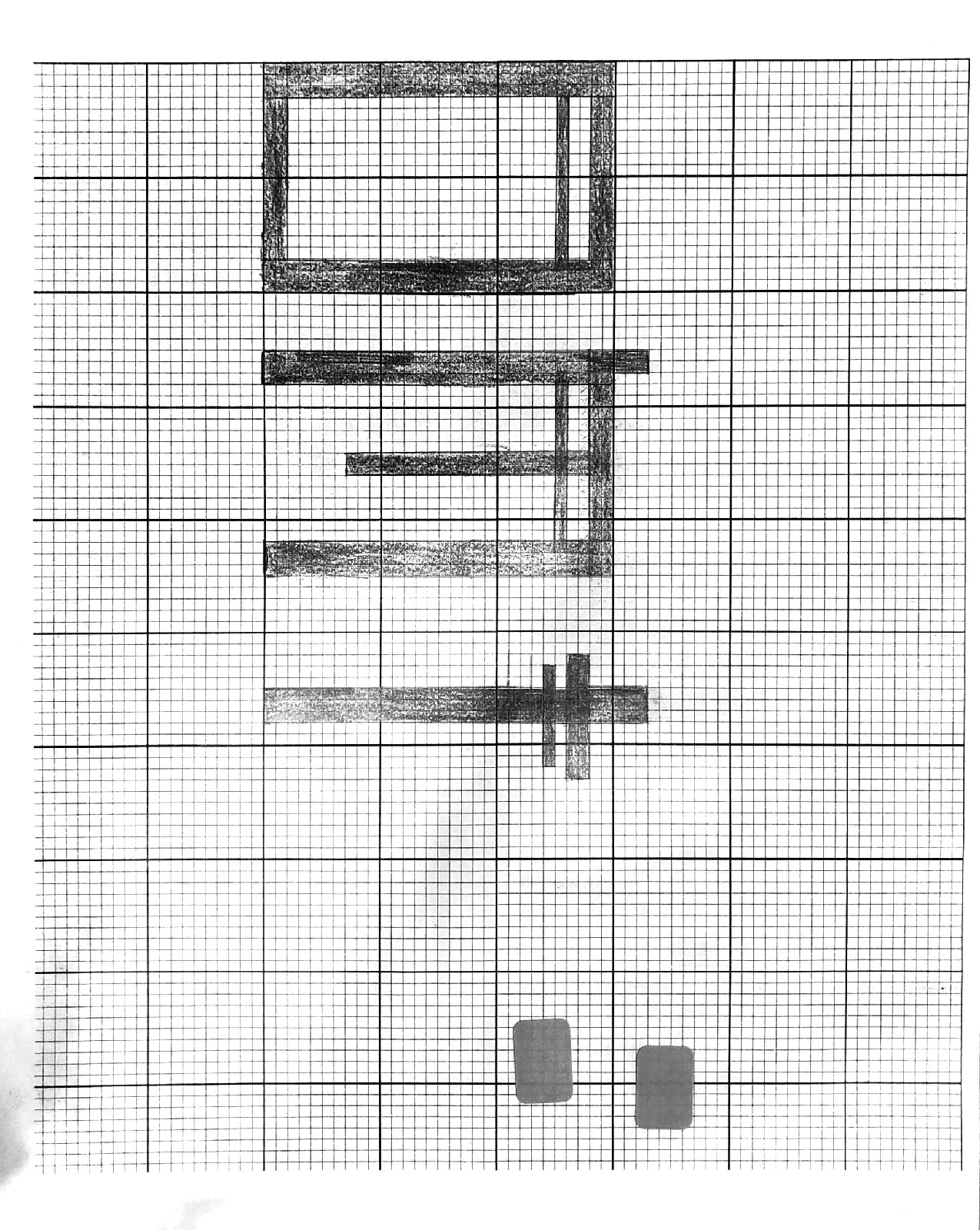
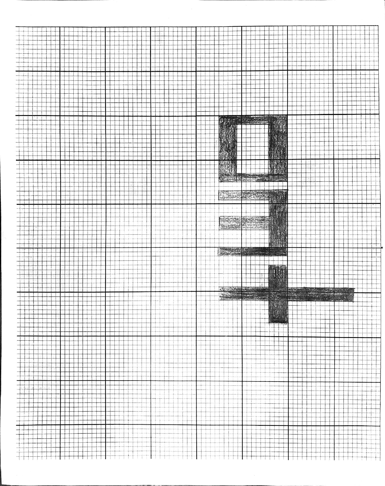
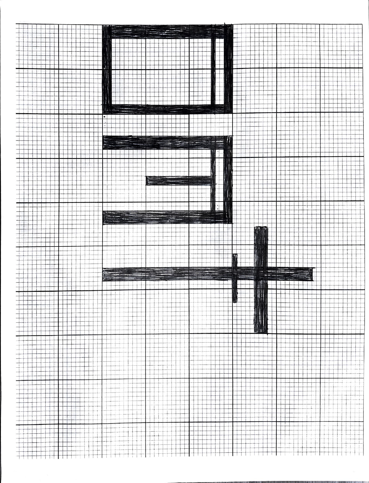
I made some very simple but necessary adjustments to my letterforms. Most importantly, properly lining up the anatomy of each letterform to the bitmap grid correctly. Although subtle, my first rendition doesn’t fit perfectly together as it should. I also adjusted the thickness of different anatomical features in each letterform, making the arm of my ‘t’, the rightmost leg of my ‘m’, and the decorative “bars” in my letterforms slightly thicker so that the piece as a whole wasn’t too unbalanced and difficult to read.
Before
After
Process Work
My bitmap monogram was inspired partially by Blackletter typefaces and exploring other alphabets, such as the Cyrillic alphabet. I turned to Cyrillic because of how easily letterforms in the alphabet fit into a bitmap grid. I struggled with this project in trying to find the best way to use balance within characters. I eventually settled on my final design with both very thick and very thin moments in the letterforms. I included the use of a serif on my ‘m’ letterform in order to add a sense of lightness to the letterform and prevent the monogram from feeling too heavy as a whole.
Cyrillic AlphabetComparison With Both InfluencesBlackletter Type


