World Heritage Site


Final Designs


Process Work
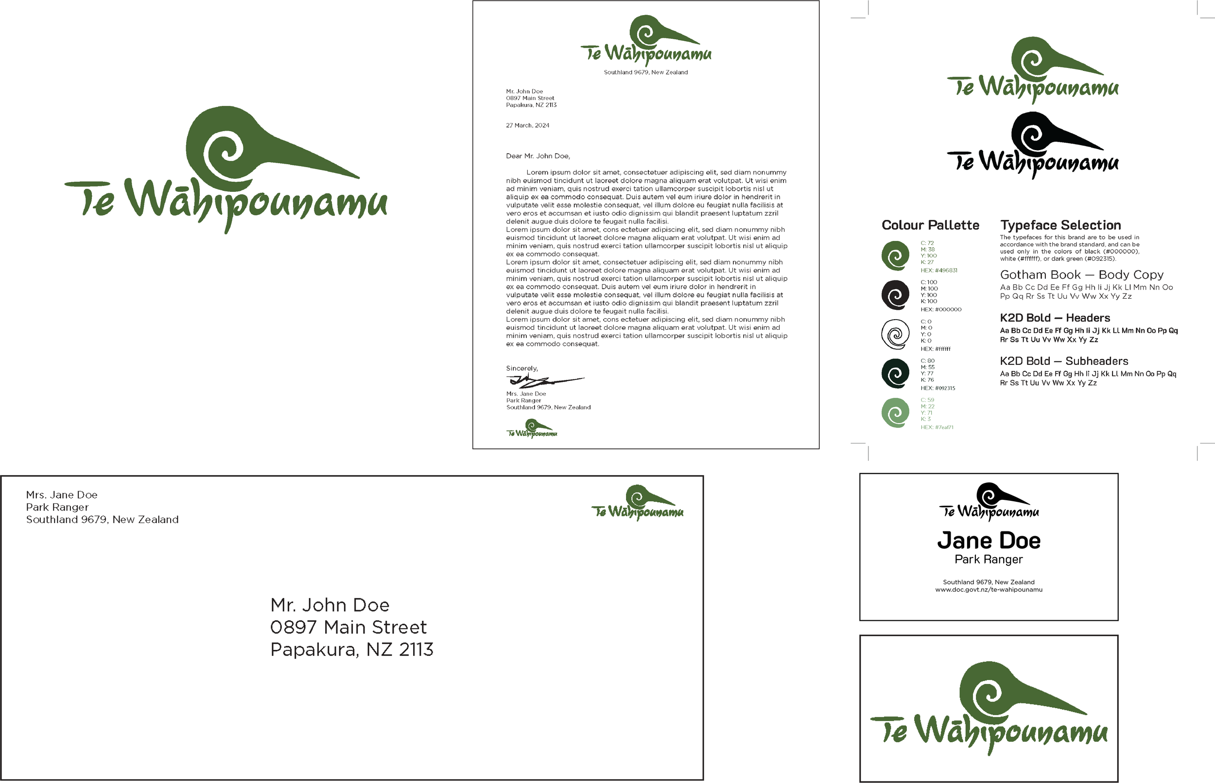
For this project, I selected the UNESCO World Heritage site of Te Wāhipounamu on New Zealand’s southern island. Because the site is both culturally and environmentally important, I incorporated elements of both topics into my designs. My sketches focused largely on getting a feel for the natural aspects of the site with drawings of flora and fauna appearing in many of them. I settled on designing a logo consisting of the name of the site and the head of a Kiwi bird formed from a Koru symbol, which comes from the native Māori tribes of New Zealand, whose connections to Te Wāhipounamu are still strong. The colours for my design emerged from the name “Te Wāhipounamu” itself, which means “the greenstone waters” in the Māori language. Because greenstone is such an important part of the culture, I designed my logo with the same rich, green colour.


More Process Work
I designed both my brochure and stationery with the same rich green to unify all of the elements, along with the repeated use of bright, scenic imagery from the site. I incorporated this into all of my designs for this project to show that the site is a natural wonder to be enjoyed. My choice of typefaces helped me lean into the natural and tropical location while keeping information legible and easy to read and digest. I use the typeface Lourdes Bold in my logo, while my headers are in K2D Medium, my body text in Gotham Book, and the labels in my diagrams are in K2D Bold Italic.


